The typeface leans, every letterform cut at the same forward angle, as though the whole identity system is mid-braking into a corner. This is the first thing you notice about Mox's refresh for Formula E, and it is a choice that comes from type design, not from motorsport livery tradition, where the convention has always been flat, stable wordmarks built to survive a camera doing 200 miles an hour.
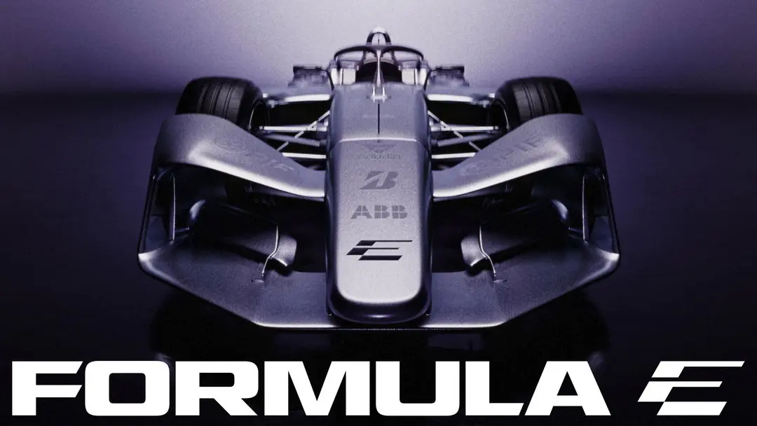
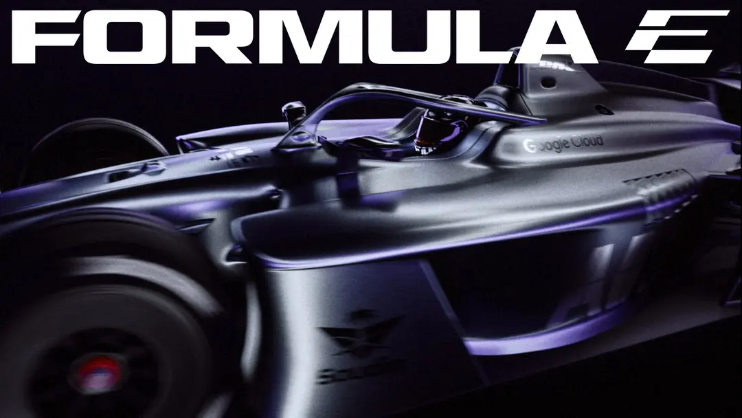
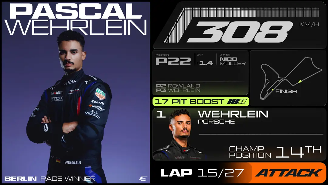

Formula E occupies a strange position among racing series: younger than Formula One by decades, electric by mandate rather than by racing tradition, and permanently compared to a sport it is not trying to be. Its branding problem has never been speed, the cars are fast, it is legitimacy, the sense that the series belongs in the same visual register as the century-old institutions it races alongside on a calendar. Previous Formula E identities leaned into futurism as shorthand, sharp angles, chrome gradients, the vocabulary of a concept car show. The Mox system does something different: it borrows the confidence of editorial design, the kind of bold, blocky type you would expect from a magazine relaunch or a record label's new logo, and applies it to a racing series.
This is a specialist discipline, motorsport livery and series branding, being redesigned by a studio whose other work sits comfortably in the territory of print and digital graphic design, the same territory that produces festival identities and museum rebrands. The result is a sport borrowing the vocabulary of a different industry entirely to solve a credibility problem that motorsport branding, on its own terms, has not solved for Formula E in over a decade of trying.
The choice to borrow from editorial design rather than motorsport convention is itself a kind of argument about where legitimacy comes from. A flat, stable wordmark built to survive a camera at speed says a series is confident in its spectacle. A leaning, editorial type system says something else: that the series wants to be read as much as watched, studied the way a magazine cover or a record sleeve is studied, for craft rather than velocity alone.
That distinction matters because Formula E's problem was never really about looking fast enough. The cars already do that. The problem was belonging, sitting on the same calendar as Formula One without inheriting any of its visual gravity. A system built from the vocabulary of festival identities and museum rebrands does not chase that gravity by mimicking it. It sidesteps the comparison entirely by competing in a different register, one where chrome and sharp angles were never the terms of the contest in the first place.
What the system signals, intentionally or not, is that Formula E has stopped trying to out-chrome Formula One's history and started trying to out-design it instead, betting that a race series can win attention the way a magazine or a record label wins a shelf, through type and color rather than spectacle alone. That bet is the more interesting of the two questions facing the series, and the design itself already makes the argument: Formula E now looks like it belongs on the same shelf as the institutions it has spent a decade chasing.