The letterforms are drawn by hand first, then digitized: three weights of a blackletter family built around the memory of David Rocastle, the Arsenal midfielder who played for the club through the late 1980s and retired from football in 1994, three decades before this typeface existed. There is no product drop attached to this, no shirt to buy. The typeface itself is the release.
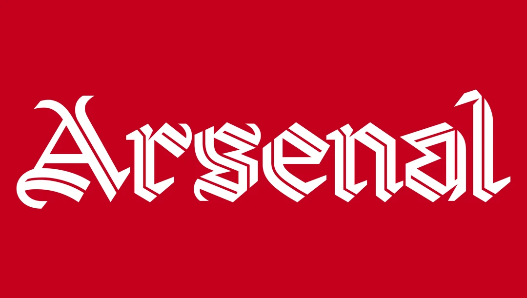
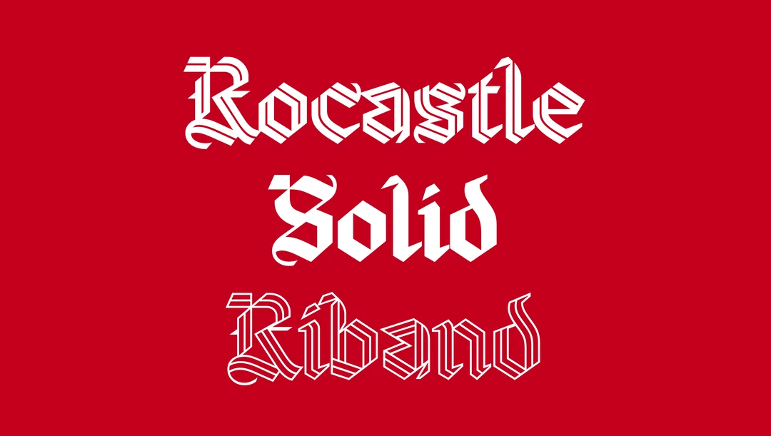
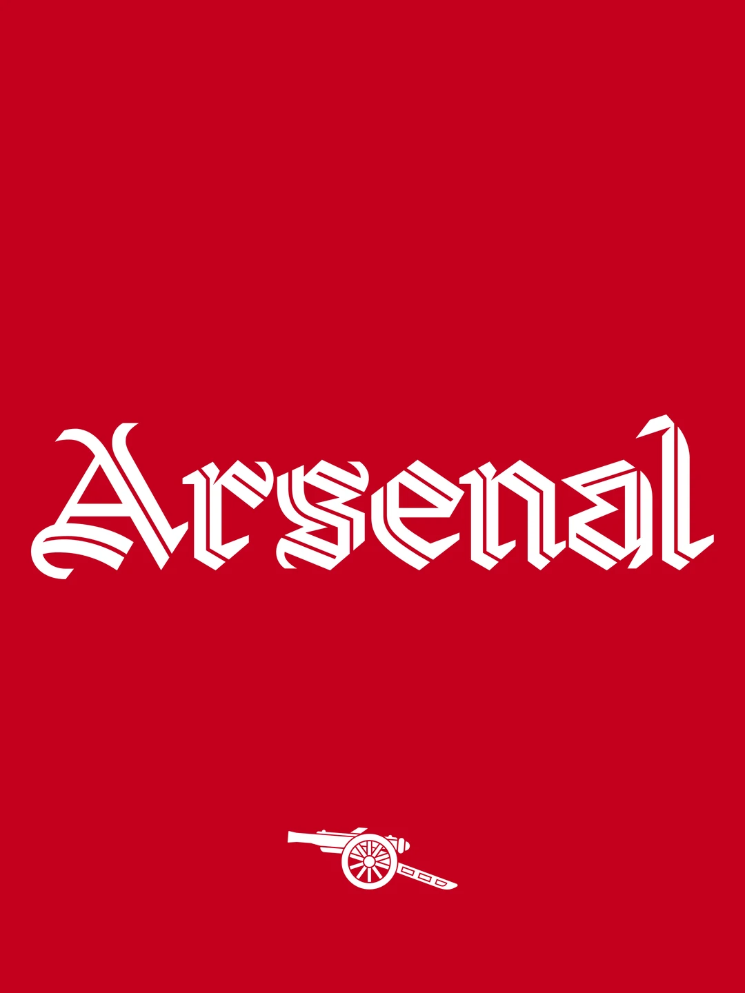

David Rudnick is a working graphic designer, the kind whose client list runs through music labels, fashion houses, and institutional rebrands, not stadium concourses. Arsenal has an in-house unit called Arsenal Creative Studio, led by Johnnie Campbell, that behaves less like a kit department and more like a design practice: commissioning original typefaces, running its own visual research, treating the club's archive the way a type foundry treats historical specimen books. This is graphic design practice, the kind normally confined to type foundries and design annuals, now sitting inside a football club's internal studio.
What makes the four-year timeline notable is the discipline it implies. A specialist typeface commission, the sort of project that might run in a design journal or win an award at a type conference, usually stays inside that world. Arsenal has pulled the entire production process, the hand-drawn studies, the weight testing, the four years of iteration, into its own content pipeline and aimed it at a football audience that has never needed to know what a blackletter weight is. The club is not simplifying type design down to football fans. It is handing football fans the full, slow, specialist process intact and trusting them to sit with it.
It's Nice That, the publication that broke this, framed it as a profile of Rudnick's craft. The craft is real, but the more durable detail is institutional: this is the second time Arsenal has worked with Rudnick, following an earlier collaboration also noted in the piece, which means Arsenal Creative Studio is not treating typography as a one-off marketing stunt but as a recurring discipline inside the club, on the same cadence a design studio might treat an ongoing client relationship.
A faster club would have licensed a stock blackletter font and called it a tribute. Arsenal spent four years building one from nothing to honor a player who has been retired for over thirty years, and in doing so quietly repositioned its in-house creative unit as a type foundry that happens to also run a football club. That positioning did not need a press conference. It needed a typeface.