Manchester City Women was founded in 1988. The club turned semi-professional in 2014 and fully professional in 2018. It has played under the Manchester City badge, unaltered, for all of it. On 8 September 2026, Nomad Studio unveiled the first identity system built specifically for the women's team: a monogram constructed from light, distinct from the parent crest.
It's Nice That framed the brief directly: the studio was "enlisted to bring something unique and 'ownable' to women-first fans." The word ownable is doing real work in that sentence. It implies the previous forty years of shared branding were not owned by women's fans at all, only lent to them.
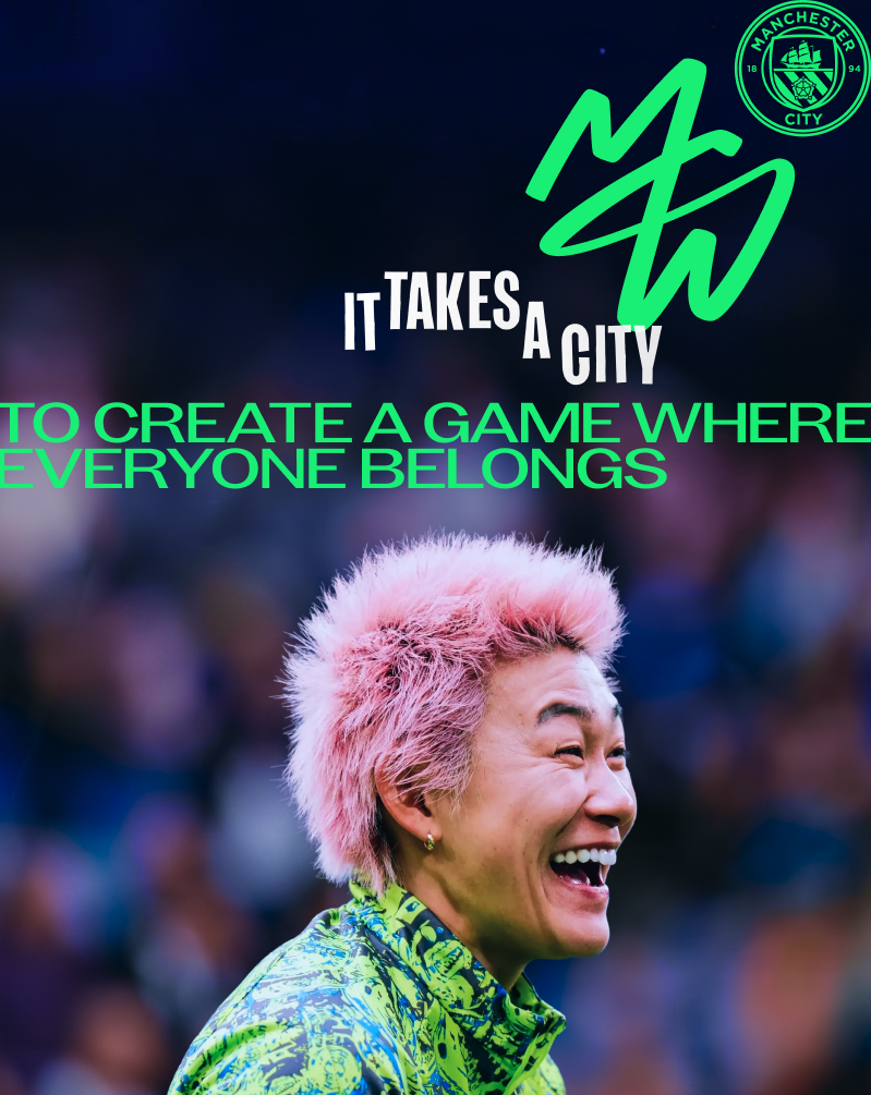
The Women's Super League has existed as a named competition since 2011. Fifteen years in, this is described as the league's first team-specific visual identity, meaning fourteen other WSL clubs still operate their women's sides under identities designed, in every recorded case, for the men's team first and extended sideways. Manchester City's is not a rebrand. It is a first build.
The gap this closes is not one of visibility. Women's football in England has drawn record broadcast numbers and stadium crowds across the past three seasons; City's own women's side has played to sellout crowds at the Etihad Campus. The gap was ownership of the symbol itself: a fanbase that filled stadiums under a badge it never got to shape.
The founding year matters here as much as the unveiling date. A club can carry a shared badge for decades without anyone treating that duration as an argument for change, until the moment a studio is enlisted and the absence becomes visible by comparison. Manchester City Women wore the parent shield through amateur years, through the move to semi-professional status, through full professionalization, and the badge itself never had to answer for any of those transitions. The monogram does not erase that history. It simply draws a line under it and starts a separate account.
It's Nice That's word choice, ownable, is worth sitting with a second time. Ownership is not the same claim as visibility, and the piece already draws that distinction: sellout crowds at the Etihad Campus and record broadcast numbers proved the audience was there long before the studio was hired. What those crowds lacked was not attention paid to them but a symbol produced with them in mind from the start. A monogram built from light, distinct from the men's crest, is a small object carrying a large implication, that a fanbase filling a stadium is entitled to a mark that was designed for it rather than handed down to it.
That is why the framing of first build against rebrand carries weight beyond design terminology. A rebrand answers to an existing identity. A first build answers to nothing but the brief. Manchester City Women's badge had no prior version of itself to revise, only forty years of borrowed shielding to finally set aside.
Fourteen WSL clubs now have a data point sitting in front of them: one competitor has shipped a team-specific identity and the trade press has already logged it as a first. The next club to commission one will be following, not leading. Manchester City Women's crest is dated 8 September 2026. Every other WSL club's equivalent, whenever it lands, will carry that date as its baseline.